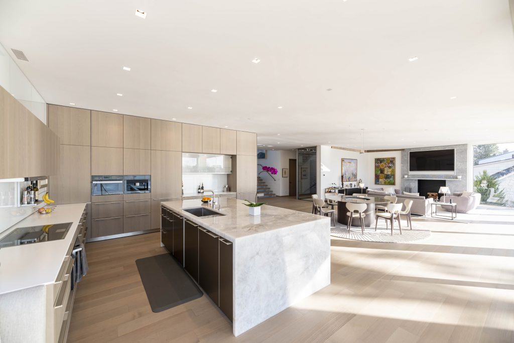
Our lifestyle habits have changed tremendously throughout time. As a result, architecture and design have followed suit. In modern design, the open plan layout takes formerly separated spaces and combines them into one large flexible space, often called the Great Room. This concept is a reflection of the lives most people live today.
Whereas historically the kitchen was a smaller, secondary space intended solely for the preparation of food, nowadays most people find that their families’ lives revolve around it. Rather than creating smaller confined spaces in the home, open plan design is about creating an awesome space that serves the lifestyle of the family within.
Once people experience an open plan, they realize that it’s a better way to live.
— Rich Granoff
At Osprey Point, it was important to Rich to develop a floor plan that would complement his and his wife Jill’s informal lifestyle, which ranges from entertaining groups of all sizes, hanging out with their kids when they are visiting or just spending an evening alone relaxing at home. Having lived in an open plan layout in their Eliot Noyes-designed Vermont house and loving it, Rich knew he wanted a similar layout in their new empty-nester Connecticut home.
The 270-degree water views at Osprey Point inspired the house design in many ways. Video via Granoff Architects.
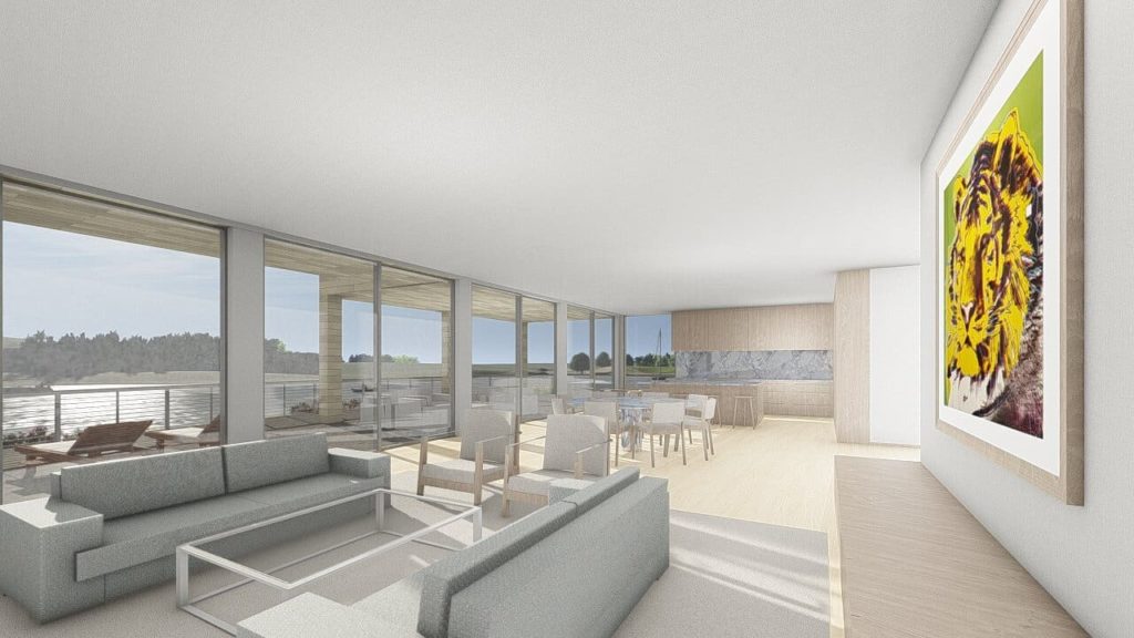
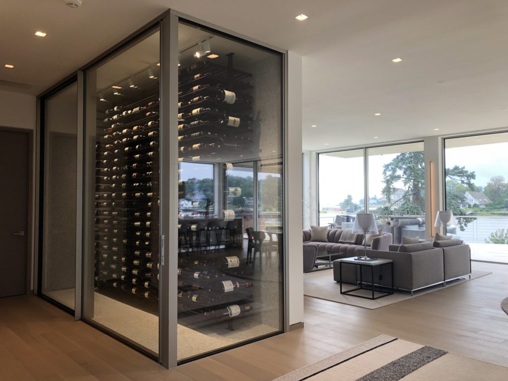
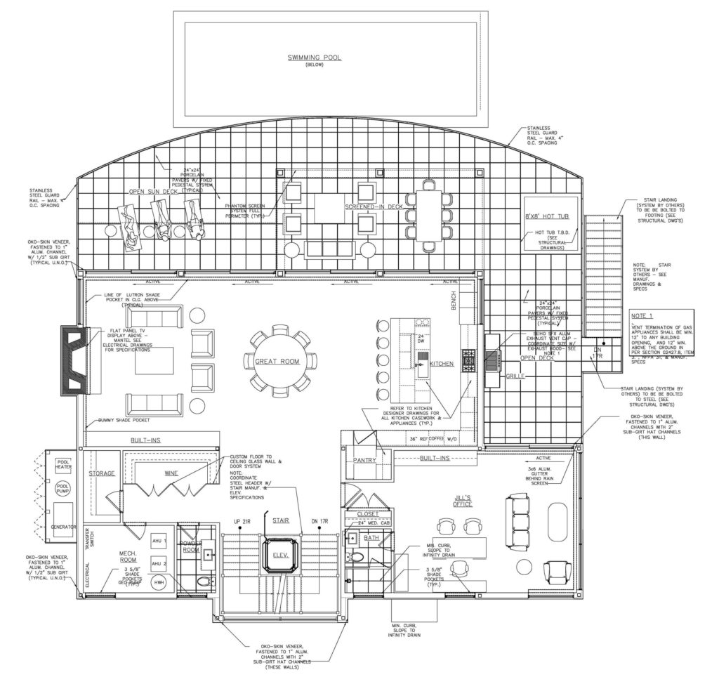
Although some open plans include a partial separation through use of pocket doors or partial walls, Rich opted for a fully open great room to maximize views and natural light. However, one of the drawbacks of this can be unwanted noise transfer which can make it difficult for focused tasks. As such, Jill Granoff’s office, which is the only other space on this floor, is isolated to the northeast corner of the house to create a more private space to work in.
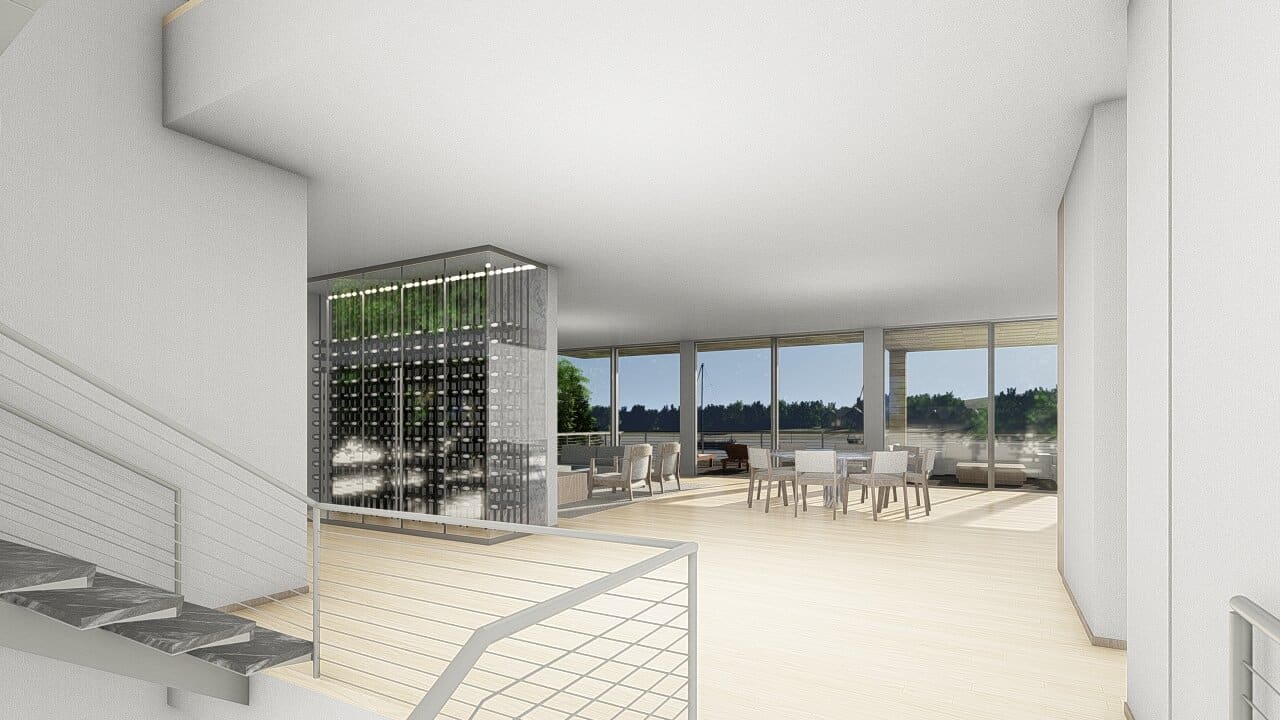
As evidenced by the floor plan, Rich dedicated most of the first floor to a large 22’ x 54’ great room that includes the kitchen, dining and living spaces. The 72” round dining table is centered on both the X and Y axis of the room with a major light fixture above, defining the space. It also creates a visual cue for visitors as it is the first thing you see from the landing at the top of the stairs. The oversized 5’ x 11’ kitchen island creates a visual boundary for the kitchen and can serve as an informal eating counter for the family or a buffet for a larger group. Furthermore, having the kitchen open to the other spaces allows cooking, which Rich loves to do, to become part of the social activity. The whole space facilitates ultimate flexibility and can range as an entertainment space for a small, intimate dinner party or a large informal gathering of many friends.
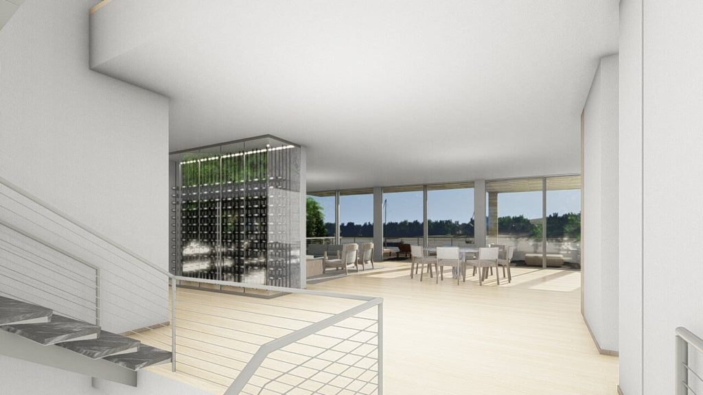
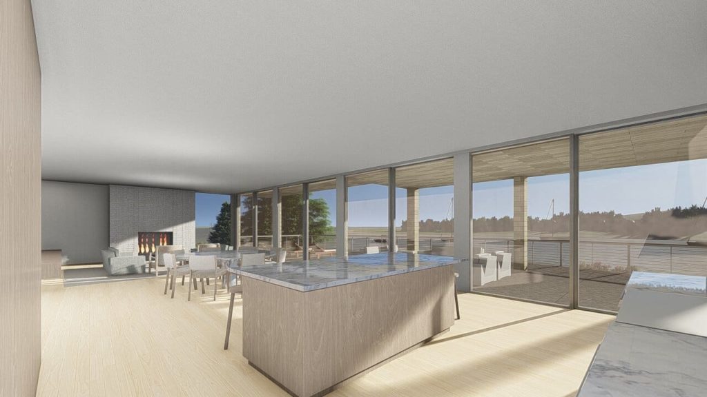
Lastly, this open plan design helps integrate the outdoor space. The deck beyond the glass wall is itself a reflection of the great room – there is a grilling and cooking area, seating for dining and an informal lounge area. The result blurs the lines between indoor and outdoor space, creating one massive space when desired. To avoid the need for a screened porch, Rich integrated phantom screens which can be controlled electronically on a hot summer day to keep the bugs out. Eliminating a permanent screen barrier helps maintain the connection from the home to the waterside landscape.
Upcoming
In the coming weeks we will take a look at how the kitchen design, interior finishes and furniture further reinforce Rich’s design intent. It will be very exciting to see this living space come together and even more exciting to see how it facilitates the lifestyle of its inhabitants. Even with only the exterior shell complete to date (see below), it is already evident how the space maximizes the views of the landscape in which it lives.
